

I and Abdel Abdellaoui have a new paper out. It deals with natural selection in modern populations. I’ve written three articles about this on my website. This reproduces the first of them, describing our main findings.
Natural selection happens when certain genetic variants spread through the population. Our paper uses data from UK Biobank, a sample of about half a million people in Great Britain, born between about 1940 and 1970. The genetic data we will look at are polygenic scores. These are summary measures of DNA which can be used to predict something about a person – say, their health, education, or personality. There’s a good explainer about polygenic scores here. We have 33 polygenic scores, on a whole range of traits from educational attainment to height to propensity for depression.
Our approach to detecting natural selection is simple. We test whether each score predicts the number of children you have. If a high polygenic score is correlated with having more children, then the score is being selected for (since, on average, children have the same score as their parents). If it’s correlated with having fewer children, the score is being selected against.
Here’s our first picture. There’ll be a few of these, so I’ll explain it in detail.
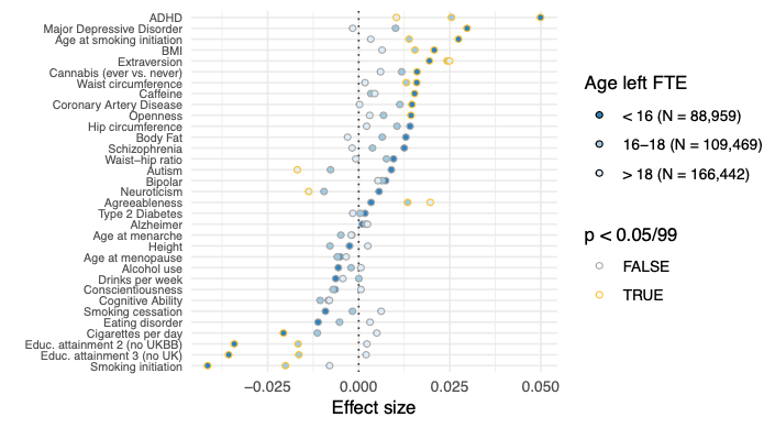
Each row represents one polygenic score. The dots represent coefficients of that score in a linear regression predicting number of children. If the dot is to the right of the zero line, then a high score predicts having more children. If it’s to the left, a high score predicts having fewer children. If the dot has a yellow border, it’s statistically significant, meaning that we’d be unlikely to see such a big result by chance.[1]
For each polygenic score, there are three dots. Each one represents a regression in a different subgroup of our sample: one for people who left education after 18; one for people who left education between 16 and 18; one for people who left before 16 (which was still possible for many in this generation).
A word about the numbers along the bottom. These show the effect size of a polygenic score’s correlation with “completed fertility”, i.e. the number of children born to a person. To be exact, they show the number of extra children predicted by a one standard deviation increase in the score. For example, among people who left education before 16, those with one standard deviation higher polygenic scores for ADHD have about 0.05 more children on average.
Although we call it an “effect size”, you shouldn’t think of this as a causal effect. It’s just a correlation. Natural selection is a claim about correlation, not causation: if a high score correlates positively with having more children, it will spread in the population, whatever the reason that makes high-scorers more fertile.
Now you know how to read the graph, you can see the patterns in it.
- There is significant evidence for natural selection on many polygenic scores. Among others, scores for educational attainment are being selected against; scores for ADHD, depression, and body mass index (BMI) are being selected for.
- There’s a clear pattern that effects are bigger among people who left education earlier. That is, the dark dots are usually farther away from zero than the light dots. This is especially true for the scores where effect sizes are biggest overall.
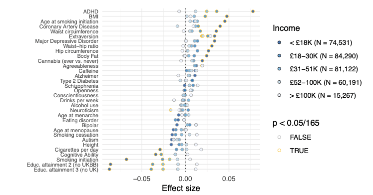
Our second picture is the same as the first, but now we split people up by household income. We see the same pattern. Effect sizes are bigger and more significant among the poorest group. They are typically small and insignificant among the richest group. Other groups are in between.
For our third picture, we split people up a different way. We separate them by whether they are living with a partner (i.e. a spouse or romantic partner). Since we thought men and women might have different patterns for this variable, we split people up by sex as well.
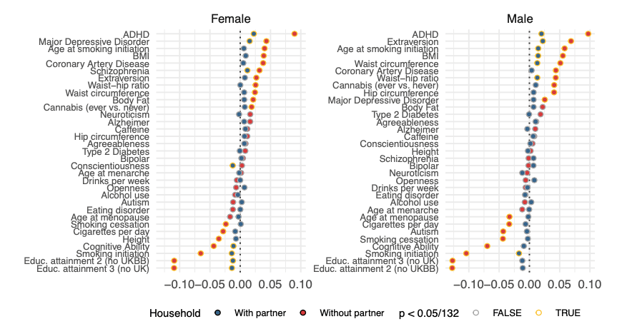
In fact, men and women look pretty similar. There are different effect sizes on some scores. But the basic pattern is the same. For both men and women, effects are bigger and more significant among people living without a partner.
Here’s one last picture. This time it splits women up by age at which they had their first child. (We don’t have this data for men, unfortunately.)
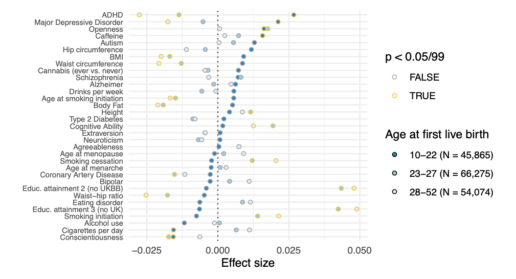
This picture shows a really striking result: the direction of effects is actually reversed among older mothers. For example, among younger mothers, high scores for ADHD correlate with more children, but among older mothers, they correlate with fewer children. Natural selection is being pushed in two different directions![2]
So, these are our basic empirical results:
- Natural selection is taking place in the sample, on several polygenic scores.
- Correlations with fertility are higher among people with lower incomes and less education, and among people who are not living with a current partner.
- Correlations with fertility are reversed among older mothers.
These patterns are repeated in several different ways. For example, if you split people by lifetime number of sexual partners, then effect sizes are bigger among those who had more sexual partners (for both men and women). Correlations are also reversed if you control for age at first live birth. That is, among women who have their first child at a given age, high polygenic scores for ADHD lead to fewer children. There’s no paradox here: high polygenic scores can also affect the age at which someone has their first child, and people who start earlier tend to have more. So there are two opposing effects here, which are balancing out.
We also look at the previous generation, by counting how many siblings people have, i.e., how many children their parents had. Here, again, there is natural selection, and the patterns are quite similar to the present generation. And, we also find that effect sizes are stronger among parents of children born in poorer areas – the same pattern again.
In Part 2, I’ll talk about what we think is going on. What explains these patterns?
[1] To be precise: we’d be unlikely to see a result so far away from zero in the sample, if the true population coefficient were zero. Because we’ve run 99 tests (3 education groups times 33 polygenic scores), we adjust for multiple testing, dividing our 5% p value threshold by 99.
[2] One cautionary note: age at first live birth is itself affected by the polygenic scores. So, polygenic scores don’t just predict people’s number of children within each category – they also predict which category they will be in. Not surprisingly, younger mothers tend to have more children overall.
Banner Image by Pete Linforth from Pixabay